The majority of the data visualisations I create, both professionally and in my personal projects, tend to be either highly customised or exists as part of a collection of many visualisations produced during a longer-form piece of analysis. There are, however, occasions where all I need to do is take a simple and relatively small dataset and produce a nice-looking bar or line graph.
For these sorts of tasks, my primary tool of choice for data visulisation - the ggplot package in R - is often overkill, as creating a graph with ggplot typically involves setting up a new project or directory, importing data into R and then exporting it (usually as a png image, which I’ll embed into a presentation or email to a colleague to use in their work).
If I will want to re-use this graph at a later date, possibly updating it with some new data, I have to crawl back through my files hoping I haven’t moved or amended the original script since first creating the graph.
Moreover, while ggplot is an incredible library for producing static graphics, it doesn’t natively support interactive visualisations. If I want to create an interactive data visualisation, I would typically turn to a JavaScript library like D3 or visx, frameworks like R Shiny, or a BI tool like Tableau - but these tools aren’t really suitable solutions for producing one simple graph.
Enter GRAPHIX, a prototype React app I’ve created to produce and share beautiful, interactive and responsive graphs with ease.
Graphing with GRAPHIX
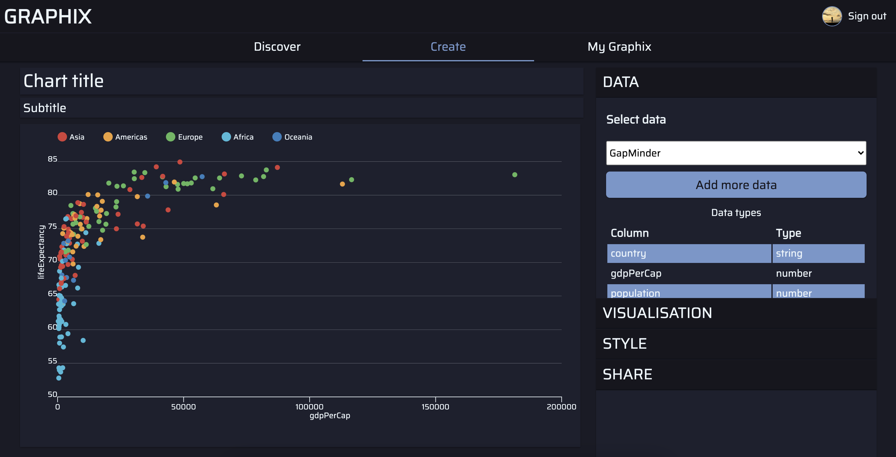
GRAPHIX is a graph building app that allows users to import csv data, select a geometry (bar, point or line), and then map the variables in their data to aesthetic features - such as the x-axis, y-axis, color and labels.
Users can style their visualisations using in-built themes and color palettes, and then save their creations to their profile. By default, any graph that a user creates will be available to all visitors to GRAPHIX, via the Discover page. Registered users can also signal their approval of a particular visualisation by ‘liking’ it.
Each user has their own profile page where they can view and manage their graphs and those that they’ve liked. Users can also direct other users and visitors to a public version of their profile.
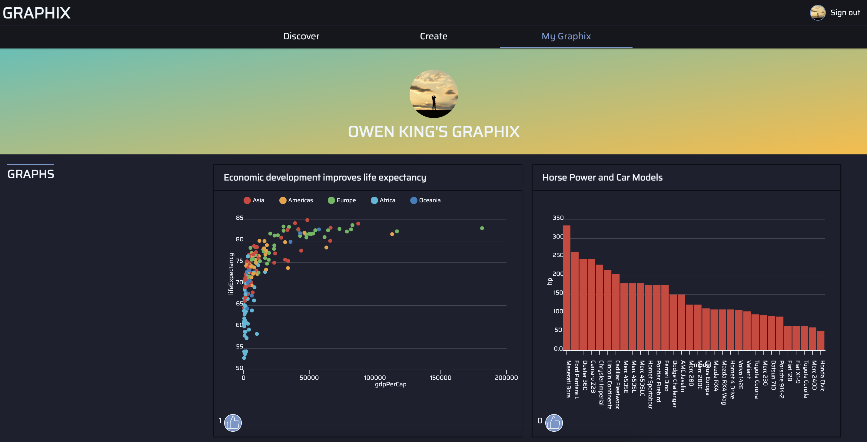
Each graph that’s created using GRAPHIX generates its own url, which when accessed provides a full screen version of the visualisation and an attribution back to the creator’s public profile.
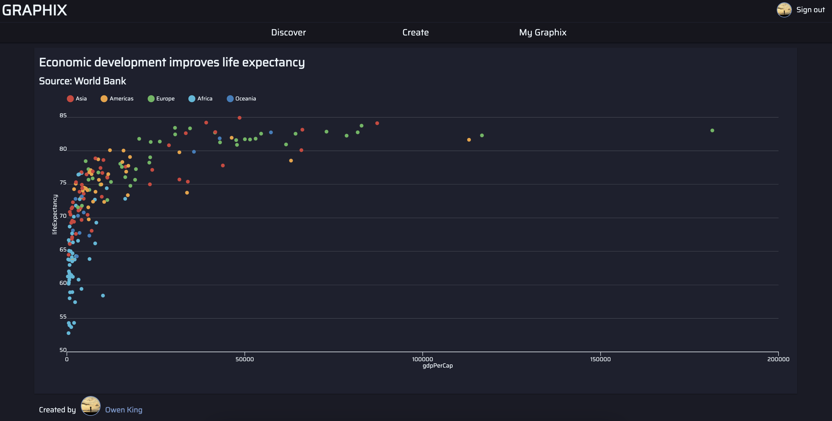
GRAPHIX’s responsive design scales across mobile, tablets and desktop devices - regardless of whether you’re viewing or creating a graph - and the visualisations are designed with pre-configured tooltips, legends and animated axes.
The technical stack
GRAPHIX was originally developed using a Node.js backend and a React frontend developed from a standard npx create-react-app boilerplate. This original version of the app used a GraphQL API built using Apollo GraphQL and hosted on Heroku. The frontend was deployed to Netlify.
This stack worked well for GRAPHIX’s graph-building features, but while developing the application I began to consider additional functionality - such as a feed of other users’ graphs, profile pages and the ability to ‘like’ other users’ creations. While it would have been possible to develop these features using the original technical stack, the complexity they would add prompted me to rebuild the app in Next.js.
I opted for Next.js as the the framework provides easy page routing as well as API routes, which allow for an app’s backend and frontend to be written and deployed in the same codebase. Next.js also provides support for TypeScript, which I was using to streamline the development process. Unfortunately, Next.js’s API routes are difficult to configure with Apollo GraphQL, so the app’s API was completely re-written using a standard REST API.
All the visualisations in GRAPHIX rely on the visx1 library, a React library for data viz built by Airbnb, and D3. The app’s styles are written in styled components, a CSS-in-JS library.
Any csv data that a user inputs is converted to JSON using the Papa Parse library before it’s stored in the database. The database itself is MongoDB, hosted on MongoDB Atlas. The schemas are written using Mongoose.
User authorisation is handled by NextAuth.js, an excellent library that makes it very easy to integrate authorisation into a Next.js app. Currently, GRAPHIX only supports logging in via a GitHub account.
Full Stack Apps with Next.js
One key advantage of Next.js is that you can write server-side code in the frontend which will be executed when a user navigates to specific page. Any page that includes a getServerSideProps() function will execute the function on the sever and then pass the results as props into the page’s component.
This technique is used on all of the main page routes on GRAPHIX. For instance, the /discover page presents users with a collection of the most liked graphs. The code for this page is as follows.2
// discover.tsx

import Link from "next/link"
import { useRouter } from "next/router"

// Visualisation component, which returns the graph
import Visualisation from "../../components/visualisations/Visualisation"

// For the server-side code
import { graphics } from "../../db/controllers/index" // A controller for the database request
import { connectToDB } from "../../db/connectToDB" // A function to connect to the database
import { GetServerSideProps } from "next/types" // types for getServerSideProps

// Props validation
type DiscoverProps = {
  graphs: any[],
  hasNextPage: boolean,
  offset: number,
}

const Discover = ({ graphs, hasNextPage, offset }: DiscoverProps) => {
  const router = useRouter()

  return (
    <>
      <div className='hero'>
        <h1>Created with GRAPHIX</h1>
      </div>
      <div className='list'>
        <h2>Most liked graphix</h2>
        {/* Map through each graph */}
        {graphs && (
          <div className='grid'>
            {graphs.map((graph) => (
              <div key={graph._id}>
                <Link href={`/view/${graph._id}`}>
                  <div>
                    <h3>{graph.title}</h3>
                    <Visualisation graph={graph} />
                  </div>
                </Link>
              </div>
            ))}
          </div>
        )}
      </div>
      {/* If the hasNextPage prop is true, return a button to push to the next set of graphs */}
      {hasNextPage && (
        <button onClick={() => router.push(`/discover/${offset + 8}`)}>
          Load more
        </button>
      )}
    </>
  )
}

export const getServerSideProps = async (context: object) => {
  // detects whether there is an offset in the page url (e.g. discover/8)
  const pageOffset = context.params.id || 0

  // Connects to the database
  await connectToDB()

  // Get the graphs
  const results = await graphics.getGraphs(pageOffset)

  // Tidy the data before it's passed to the component
  const graphs = results.graphics.map((doc) => {
    const graph = doc.toObject()
    return { ...graph, data: JSON.parse(graph.data) }
  })

  // de-structure hasNextPage from the results
  const { hasNextPage } = results

  // Return props to the component
  return {
    props: { graphs, hasNextPage, offset: pageOffset },
  }
}

export default Discover
The getServerSideProps() function on this page first checks whether there are any additional parameters on the /discover url, which are used for page pagination. The function then connects to the database and fetches the graphs using the getGraphs() controller. This controller returns eight graphs from the value of offset - or the first eight records if offset is undefined.
The data property on each graph object is returned as a string, so we convert this to a JSON object. The getServerSideProps() function then returns three properties: an array of graphs; hasNextPage, which is true when there are more graphs on the server; and the offset of the current page.
These props are then passed to the Discover component, which iterates through the graphs - passing each one to a Visualisation. This component returns an svg graphic for each graph that’s passed into it.
If hasNextPage is equal to true, the Discover component also renders a button that when clicked pushes the user to the /discover route with an offset value of eight more than the current value.
A very similar pattern is replicated on the other routes in the app, though the /create and /user routes are protected and check for authorisation before fetching any data: If a user is not signed in, the getServerSideProps() function will push them to /signin, preventing the protected routes from loading any components.
Representing Graphs in MongoDB
One of the reasons that GRAPHIX only supports simple graphs is that more complicated visualisations would require a bewildering list of fields for different visual aesthetic features, scales or design choices. As GRAPHIX provides a graphical user interface, each one of these fields would need to be represented by some form of user input - potentially compromising the appeal of a tool which is designed to make it quick and easy to design a good-looking data visualisations.
The Mongoose schema for the graphics collection, which holds the data for each graph that a user creates, is below. Some of these fields, such as reordered are only relevant for a particular geometry - in this case reordering the categories on the bar graph in descending order.
// graphics.ts
import mongoose from "mongoose"
import { nanoid } from "nanoid"

const graphicsSchema = new mongoose.Schema(
  {
    _id: {
      type: String,
      default: () => nanoid(),
    },
    data: {
      type: String,
      required: true,
    },
    x: {
      type: String,
      required: true,
    },
    y: {
      type: String,
      required: true,
    },
    color: {
      type: String,
      required: false,
    },
    geometry: {
      type: String,
      required: true,
    },
    reordered: {
      type: Boolean,
      required: false,
    },
    label: {
      type: String,
      required: false,
    },
    title: {
      type: String,
      required: false,
    },
    subtitle: {
      type: String,
      required: false,
    },
    theme: {
      type: String,
      required: true,
    },
    palette: {
      type: String,
      required: true,
    },
    createdBy: {
      type: String,
      required: true,
    },
    styles: {
      xAxis: {
        textDirection: {
          type: String,
          required: true,
          default: () => "horizontal",
        },
      },
    },
    public: {
      type: Boolean,
      required: true,
      default: true,
    },
    likes: {
      type: Number,
      default: 0,
    },
    likedBy: [
      {
        type: String,
      },
    ],
  },
  {
    timestamps: true,
    collection: "graphics",
  }
)

export const Graphics =
  mongoose.models.Graphics || mongoose.model("Graphics", graphicsSchema)
The styles field is only partly developed, and could in time be augmented with nested documents for storing information on the text orientation, color or positioning of the x axis and other features like the y axis, legend or plot area.
Global State with the Context API and React Hooks
One of the core principles of developing a React application is breaking down features of the UI into modular components that can manage their own state and exchange data with other components. Where you have a lot of user inputs however, this can become difficult to manage without excessive prop-drilling.
In the case of GRAPHIX’s create page, there are many different combinations of user inputs to select geometries, map aesthetic features or style visualisations. Some of these are conditional on a user input somewhere else in the application - for instance, the point geometry only permits the user to select numerical values for X and Y, while selecting the ‘bar’ geometry will lead the app to provide an option for reordering the bars, which is hidden if ‘line’ or ‘point’ is selected. Furthermore, all these selections have to be reflected on the visualisation, which occupies a separate branch of the application from the controls.
For this reason, I opted to leverage React’s Context API to handle the user inputs related to the data visualisation. Context provides a way to pass data though a React application without passing down props through each level.
In GRAPHIX, the SelectionsProvider component manages state and provides functions to update the selections related to creating a data visualisation.
// SelectionsProvider.tsx
import { createContext, useState } from "react"
import { gapMinder } from "../data/GapMinder" // static data for when the app loads the first time

export const SelectionContext = createContext()

export default function SelectionProvider({ children }) {
  // The initial state of selections when a user navigates to /create
  const [selections, setSelection] = useState({
    data: gapMinder,
    x: "gdpPerCap",
    y: "lifeExpectancy",
    color: "region",
    geometry: "point",
    reordered: false,
    label: "country",
    theme: "dark",
    title: "Chart title",
    subtitle: "Subtitle",
    palette: "default",
    interaction: "none",
    public: true,
    styles: {
      xAxis: {
        textDirection: "horizontal",
      },
    },
  })

  // A function for updating the user selections
  const updateSelections = (value) => {
    const key = Object.keys(value).toString()
    let newSelections

    if (key === "data") {
      newSelections = {
        ...value,
        theme: selections.theme,
        palette: selections.palette,
        title: selections.title,
        subtitle: selections.subtitle,
        styles: selections.styles,
        public: true,
      }
    } else if (key === "geometry") {
      newSelections = {
        ...selections,
        ...value,
        x: false,
        y: false,
        label: false,
        color: "none",
        title: selections.title,
        subtitle: selections.subtitle,
        styles: selections.styles,
        public: true,
      }
    } else {
      newSelections = { ...selections, ...value }
    }
    setSelection(newSelections)
  }

  // Return the selections object and update selections function
  return (
    <SelectionContext.Provider
      value={{
        ...selections,
        updateSelections,
      }}
    >
      {children}
    </SelectionContext.Provider>
  )
}
This provider is then abstracted into its own React hook, useSelections().
// useSelections.ts
import { useContext } from "react"
import { SelectionContext } from "./SelectionProvider"

export const useSelections = () => useContext(SelectionContext)
The advantage of this approach is that as the entire /create page is wrapped in the SelectionProvider component, any child component can access or modify global state using the useSelections() hook.
For instance, the share section of the controls features a checkbox input to toggle the public field in our selections, which determines whether a graph is posted to the /Discover page.
// shareControls.tsx
import { useSelections } from '../../../hooks'

const ShareControls = () => {
  const { public, updateSelections } = useSelections()

  return (
    <>
    ...
     <input id="public" type="checkbox" checked={public}
        onChange={() => updateSelections({ public: !public })} />
     <label htmlFor="public">Post graph to Discover</label>
     ...
    </>
  )
What’s next for GRAPHIX?
While developing GRAPHIX I was forced to accept a number of trade-offs in how its visualisation system worked: certain data types are only supported by particular geometries; the geometries themselves are mutually exclusive; tooltips behave and display data in a prescriptive way. For the most part, these trade-offs are necessary because they enable the app to provide a simple interface to building graphs quickly. While it’s only a prototype, if I were to continue to develop it along its current lines it would inevitably evolve into a highly opinionated tool - not only making assumptions about what types of data are relevant to particular charts, but enforcing strict ideas about how graphs should be constructed and interacted with.
This is - in my view - the inherit limitation of almost any GUI-based tool for data viz: Providing more options for customisation means more buttons, forms or menus to navigate. Users then spend time wrangling with inputs that should actually be spent exploring, analysing and asking questions about their data.
I started coding in R in 2017 and was drawn to the ggplot package because it provided a simple interface that did the opposite of the GUI tools I was previously using. Its elegant, code-based interface made it easy to create very customised visualisations, but made me conscious of the more important elements of data visualisation. Is this visualisation actually an accurate reflection of the data? If I visualised the data in a different way, would I see something else? How can I visualise this data to evaluate some of its limitations or gaps?
GUI tools like GRAPHIX definitely have their place for creating simple graphs however, particularly for professions where data visualisation is only one component of work.
I’ll likely develop GRAPHIX a little further - possibly adding support for a few more chart types, a few more options to customise the axes or labels, and providing the option to download an image of the visualisation or embed it into another site.
Footnotes
-
visx also provided the inspiration for GRAPHIX’s name ↩
-
I’ve simplified this example very slightly, mainly to remove the styled components. The full code is available the GRAPHIX GitHub repo ↩