This analysis looks at trends in internal migration in the UK. The data comes from the UK’s Office for National Statistics, which publishes annual estimates of the number of people moving between each local authority in England and Wales. It is available to download here.
As the data provides an estimate of the number of migrations for each local authority combination, it’s perfect for network analysis. Network analysis is concerned with the visualisation of relationships between different objects. Relationships in network analysis are often called ‘edges’, while the objects of the analysis are called ‘nodes’.
The excellent ggraph package is an extension to ggplot that provides a suite of functions for analysing and visulising networks. Here, we’ll use it to identify the flows of people between between different local authority areas.
Reading in and cleaning the data
The internal migration data comes in two separate csv files, which we’ll read in using the fread function from the data.table package. We’ll then bind these two files together.
The estimates provide a breakdown by gender, which we’re not interested in here. Because they’re model-based estimates, they’re also not whole numbers - so we add the figures for each gender together, and then round the estimate to the nearest whole number.
library(tidyverse)

migration <- data.table::fread("Detailed_Estimates_2018_Dataset_1_2019_LA_boundaries.csv") %>%
  bind_rows(data.table::fread("Detailed_Estimates_2018_Dataset_2_2019_LA_boundaries.csv")) %>%
  janitor::clean_names() %>%
  # Counting total number of moves by age (including both genders) of both genders
  group_by(out_la, in_la, age) %>%
  summarise(moves = sum(moves) %>% round(0)) %>%
  ungroup()

migration
## # A tibble: 1,093,317 x 4
## out_la in_la age moves
## <chr> <chr> <int> <dbl>
## 1 E06000001 E06000002 0 1
## 2 E06000001 E06000002 1 1
## 3 E06000001 E06000002 2 4
## 4 E06000001 E06000002 3 4
## 5 E06000001 E06000002 5 6
## 6 E06000001 E06000002 6 4
## 7 E06000001 E06000002 7 1
## 8 E06000001 E06000002 8 4
## 9 E06000001 E06000002 9 3
## 10 E06000001 E06000002 10 1
## # … with 1,093,307 more rowsThe local authorities are here denoted by their GSS code. These codes are extremely useful when merging lots of different datasets together, as the names can often be written slightly differently. For our analysis however, the place names are more useful - so we’ll read in a separate Excel file with a lookup of codes to names, so we can add these to our data.
Using the codes to names data, we can also attribute each local authority to an area of the England and Wales. This is important if we want to look at migration in a particular region, or merge a number of local authorities into a single node. Later in the analysis, we’ll merge all the London boroughs into a single node - we’re more interested in migration to London overall, than migration to any particular borough of London.
local_authority_codes <-
  readxl::read_xlsx("lasregionew2018.xlsx", skip = 4) %>%
  select("la_code" = 1, "la_name" = 2, "region" = 4)

london_codes <- local_authority_codes %>% filter(region == "London")
Migration between towns and cities
One challenge with the data is that it includes an estimate of migration or every possible local authority combination, even though many of these locations will be predominantly rural areas.
What we’re interested in is migration between larger urban areas. Fortunately, Parliament.uk have published a breakdown of which local authorities are predominantly urban. For our analysis, we’ll take any local authority where the share of the population classified as living in a city or large town is greater than 70% - this leaves us with a list of around 100 large towns and cities, which we’ll merge into the data.
towns_and_cities <- read_csv("lauth-classification-csv.csv") %>%
  filter(classification %in% c("Core City (London)", "Core City (outside London)",
                               "Other City", "Large Town")) %>%
  filter(percent_of_localauth > 0.7) %>%
  distinct(localauth_code, localauth_name) %>%
  rename("la_code" = localauth_code, "la_name" = localauth_name)

# Merging the towns and cities into the migration data
migration <- migration %>%
  inner_join(local_authority_codes %>% select(la_code, la_name), by = c("in_la" = "la_code")) %>%
  semi_join(towns_and_cities, by = c("in_la" = "la_code")) %>%
  select(-in_la) %>%
  rename("in_la" = la_name) %>%
  inner_join(local_authority_codes %>% select(la_code, la_name), by = c("out_la" = "la_code")) %>%
  semi_join(towns_and_cities, by = c("out_la" = "la_code")) %>%
  select(-out_la) %>%
  rename("out_la" = la_name) %>%
  select(out_la, in_la, age, moves)
Merging all the London Boroughs
We’ll now merge all the London boroughs, and join this back into the migration data.
moves_to_london <- migration %>%
  filter(in_la %in% london_codes$la_name) %>%
  filter(!(out_la %in% london_codes$la_name)) %>%
  group_by(out_la, age) %>%
  summarise(moves = sum(moves)) %>%
  mutate(in_la = "London")

moves_from_london <- migration %>%
  filter(out_la %in% london_codes$la_name) %>%
  filter(!(in_la %in% london_codes$la_name)) %>%
  group_by(in_la, age) %>%
  summarise(moves = sum(moves)) %>%
  mutate(out_la = "London")

moves_london <- bind_rows(moves_to_london, moves_from_london)

migration <- migration %>%
  filter(!(in_la %in% london_codes$la_name)) %>%
  filter(!(out_la %in% london_codes$la_name)) %>%
  bind_rows(moves_london)
Exploring Migration Between England and Wales’ urban areas
To visualise the network, we’ll need to build two datasets - one containing the towns and cities, which we’ll call ‘nodes’; and one containing the migration numbers for each combination, which we’ll call ‘edges’.
We won’t look at migration of all age groups - we’ll focus instead on those people aged between 23 and 30 years old. Typically, this is a time in life when people are more likely to migrate, as they may have recently finished their education and haven’t yet started a family or bought a home.
We’ll also add some other details to the nodes data - the region that the node is located in, as well as the total moves into the node. We’ll use both of these columns in the visuals later on.
# Creating the nodes data
nodes <- migration %>%
  select(out_la) %>%
  distinct() %>%
  rowid_to_column(var = "id") %>%
  rename("city" = out_la)

# Creating the edges data
edges <- migration %>%
  group_by(out_la, in_la) %>%
  # filtering those records where people are between 23 and 30 years old.
  filter(age %in% c(23:30)) %>%
  summarise(moves = sum(moves)) %>%
  ungroup() %>%
  left_join(nodes, by = c("out_la" = "city")) %>%
  rename("from" = id)

edges <- edges %>%
  left_join(nodes, by = c("in_la" = "city")) %>%
  rename("to" = id)

edges <- edges %>% select(from, to, moves)

# Calculate the total moves into each area, and merging into the migration data
moves_total <- edges %>%
  group_by(to) %>%
  summarise(total_moves = sum(moves)) %>%
  ungroup()

nodes <- nodes %>%
  left_join(moves_total, by = c("id" = "to")) %>%
  left_join(local_authority_codes %>% select(la_name, region), by = c("city" = "la_name"))

# Doing some basic cleaning
nodes[is.na(nodes$region),]$region <- "London"

nodes <- nodes %>%
  arrange(region, id) %>%
  mutate(city = fct_inorder(city))
To create the network visualisations, we need to convert the data into a
specialist structure which gggraph understands. We can do this using
the graph_from_data_frame() function from the igraph package. The
arguments to these functions are the edges and nodes dataframes we just
created.
We can then pass the network data to the ggraph() function to produce
a network visualisation. The resulting plot is pretty, but not
particularly useful - as there is some level of migration between all
the town and cities, every node is connected. We’ll want to further
refine our analysis as we progress.
library(ggraph)
library(igraph)

migration_net <- graph_from_data_frame(d = edges, vertices = nodes, directed = TRUE)

ggraph(migration_net, layout = 'kk') +
  geom_edge_link(aes(alpha = moves), show.legend = FALSE) +
  geom_node_point(aes(size = total_moves), show.legend = FALSE) +
  scale_edge_width(range = c(0.2, 1))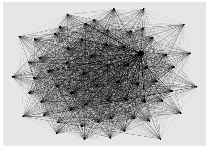
Where contributes the most young people to London?
One way of approaching the data is to look at migration to a particular
location, allowing us to see which town and cities contribute the most
migrants. The code below does this for London, using the ‘linear’ layout
of ggraph(), with circular set to TRUE.
In preparing the edges data, we also only look at combinations of towns and cities where more 100 people moved to the city in question. This reduces the number of rows in the edges data from over 3,000 to 182.
Note that these edges are directed, so we can visualise not just
migration to a city, but also migration from the city by setting the
‘directed’ parameter in ggraph() to TRUE and using the function
geom_edge_fan().
ldn_id <- nodes[nodes$city == "London", ]$id

edges %>%
  filter(moves > 100) %>%
  mutate(london = if_else(to %in% ldn_id | from %in% ldn_id, TRUE, FALSE)) %>%
  graph_from_data_frame(vertices = nodes, directed = TRUE) %>%
  ggraph(layout = 'linear', circular = TRUE) +
  geom_edge_fan(aes(alpha = moves, col = london, width = moves), arrow = arrow(length = unit(2, "mm")),
                end_cap = circle(4, "mm"), show.legend = FALSE) +
  geom_node_point(aes(size = total_moves), shape = 21, show.legend = FALSE, col = "skyblue") +
  geom_node_text(aes(label = city), alpha = 0.5, family = "Segoe UI Light") +
  scale_alpha_continuous(range = c(0.1, 0.5)) +
  scale_edge_width(range = c(0.2, 1)) +
  scale_edge_color_manual(values = c("TRUE" = "skyblue", "FALSE" = "lightgrey")) +
  theme_graph(background = "white", base_family = "Segoe UI Light") +
  labs(title = "Sources of young person migration to London")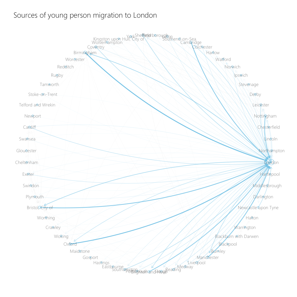
In the above plot, thicker lines denote higher levels of migration.
If we want to do this for other towns and cities, we can create a function to quickly generate new plots. This saves a lot of copying and pasting.
plot_migration <- function(city, color = "skyblue") {

  city_id <- nodes[nodes$city == city, ]$id

  nodes_city <- nodes %>% mutate(target_city = if_else(city_id == id, TRUE, FALSE))

  edges %>%
    filter(moves > 100) %>%
    mutate(city_to_from = if_else(to %in% city_id | from %in% city_id, TRUE, FALSE)) %>%
    graph_from_data_frame(vertices = nodes_city, directed = TRUE) %>%
    ggraph(layout = 'linear', circular = TRUE) +
    geom_edge_fan(aes(col = city_to_from, alpha = city_to_from, width = moves),
                  arrow = arrow(length = unit(2, "mm")),
                  end_cap = circle(4, "mm"), show.legend = FALSE) +
    geom_node_point(aes(col = target_city), shape = 21, show.legend = FALSE) +
    geom_node_text(aes(label = city), alpha = 0.5, family = "Segoe UI Light") +
    scale_edge_width(range = c(0.2, 1)) +
    scale_edge_alpha_discrete(range = c(0.2, 1)) +
    scale_edge_color_manual(values = c("TRUE" = color, "FALSE" = "lightgrey")) +
    scale_color_manual(values = c("TRUE" = color, "FALSE" = "lightgrey")) +
    theme_graph(background = "white", base_family = "Segoe UI Light") +
    labs(title = paste0("Sources of young person migration to ", city))
}
Calling our function will then generate the formatted plot.
plot_migration(city = "Manchester", color = "red")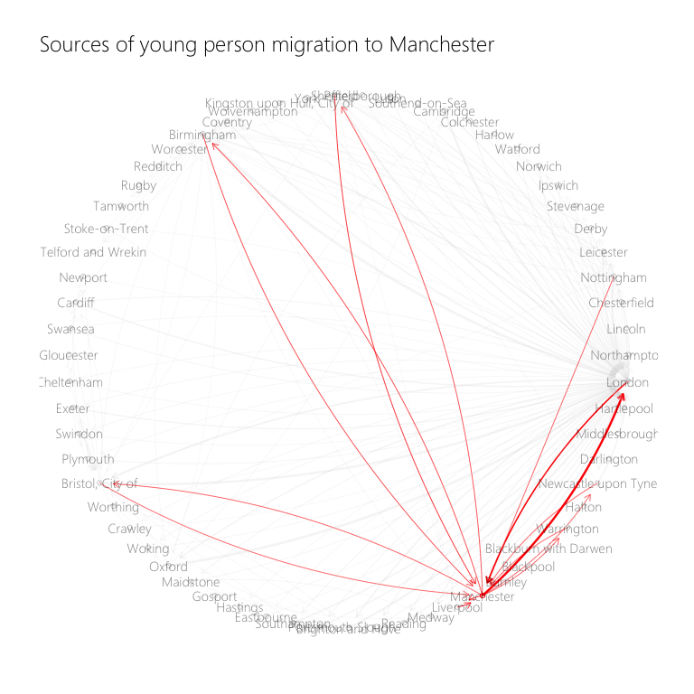
plot_migration(city = "Bristol, City of", color = "darkblue")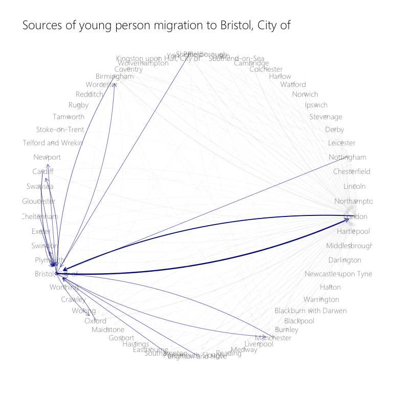
How are different towns and cities connected?
After we set our threshold for sizeable migration to 100 people, we may then want to explore how connected the different towns and cities are - e.g. are there areas which have sizeable migration flows to lots of other cities, and are there locations which have no sizeable migration flows?
This is what the plot below shows. London is the centre, as it has the most connections of any area. We can also pick out locations like Bristol and Birmingham, which have a lot of connections too.
On the edges of the visualisation, we can see locations like Blackburn and Hartlepool, which have no connections to any areas - these locations do not see any sizeable migration of young people either in or out.
migration_net <- graph_from_data_frame(d = edges %>% filter(moves > 100),
                                       vertices = nodes, directed = TRUE)

ggraph(migration_net, layout = "kk") +
  geom_edge_fan(aes(alpha = moves), arrow = arrow(length = unit(2, "mm")),
                end_cap = circle(4, "mm"), show.legend = FALSE) +
  geom_node_point(shape = 21) +
  scale_edge_width(range = c(0.2, 1)) +
  geom_node_text(aes(label = city), alpha = 0.5, family = "Segoe UI Light") +
  labs(title = "Migration of young people between England and Wales' largest towns and cities") +
  theme_graph(border = FALSE, title_family = "Segoe UI Light")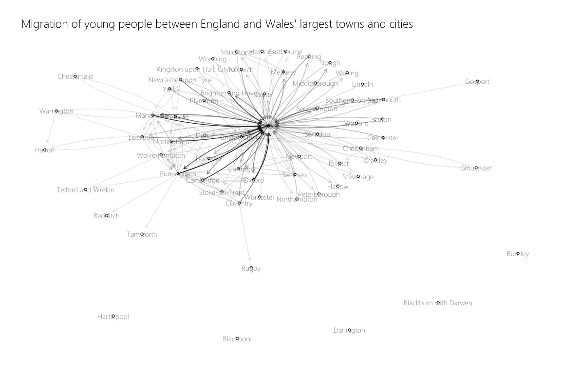
Where are the key hubs of migration across the regions of England and Wales?
We can also build a visualisation by region, exploring how interconnected towns and cities are within a particular refion. To do this, we’ll need to re-create out network data to include only flows where the migration is inside the region. We’ll also lower the threshold of migration in the edges from 100 people to 50 people.
migration_intra_region <- migration %>%
  left_join(local_authority_codes %>% select("out_la" = la_name, "out_region" = region)) %>%
  left_join(local_authority_codes %>% select("in_la" = la_name, "in_region" = region)) %>%
  filter(!is.na(out_region)) %>% # Removes London
  filter(out_region == in_region) %>%
  filter(age %in% c(23:30)) %>%
  group_by(out_la, in_la, out_region, in_region) %>%
  summarise(moves = sum(moves)) %>%
  ungroup()

nodes <- migration_intra_region %>%
  select(out_la, out_region) %>%
  distinct() %>%
  rowid_to_column(var = "id") %>%
  rename("city" = out_la, "region" = out_region)

edges <- migration_intra_region %>%
  left_join(nodes, by = c("out_la" = "city")) %>%
  rename("from" = id)

edges <- edges %>%
  left_join(nodes %>% rename("in_la" = city, "in_region" = region)) %>%
  rename("to" = id)

edges <- edges %>% select(from, to, moves)

migration_intra_region_network <- graph_from_data_frame(d = edges %>% filter(moves > 50),
                                                        vertices = nodes, directed = TRUE)
The visualisation below is very informative. We can see in the East, for instance, that only Cambridge, Norwich, Ipswich and Colchester have sizeable migration flows in their region.
In the South West, all locations are linked to Bristol, though almost all the other locations don’t have sizeable migration flows between them. The picture is similar in the West Midlands, where Birmingham is the centre of migration but the other locations are generally not connected.
ggraph(migration_intra_region_network, layout = 'kk') +
  geom_edge_fan(aes(alpha = moves),
                arrow = arrow(length = unit(2, "mm")),
                end_cap = circle(2, "mm"),
                show.legend = FALSE) +
  geom_node_point(show.legend = FALSE) +
  geom_node_text(aes(label = city)) +
  scale_edge_width(range = c(0.1, 5)) +
  facet_nodes(~region, scales = "free", ncol = 2)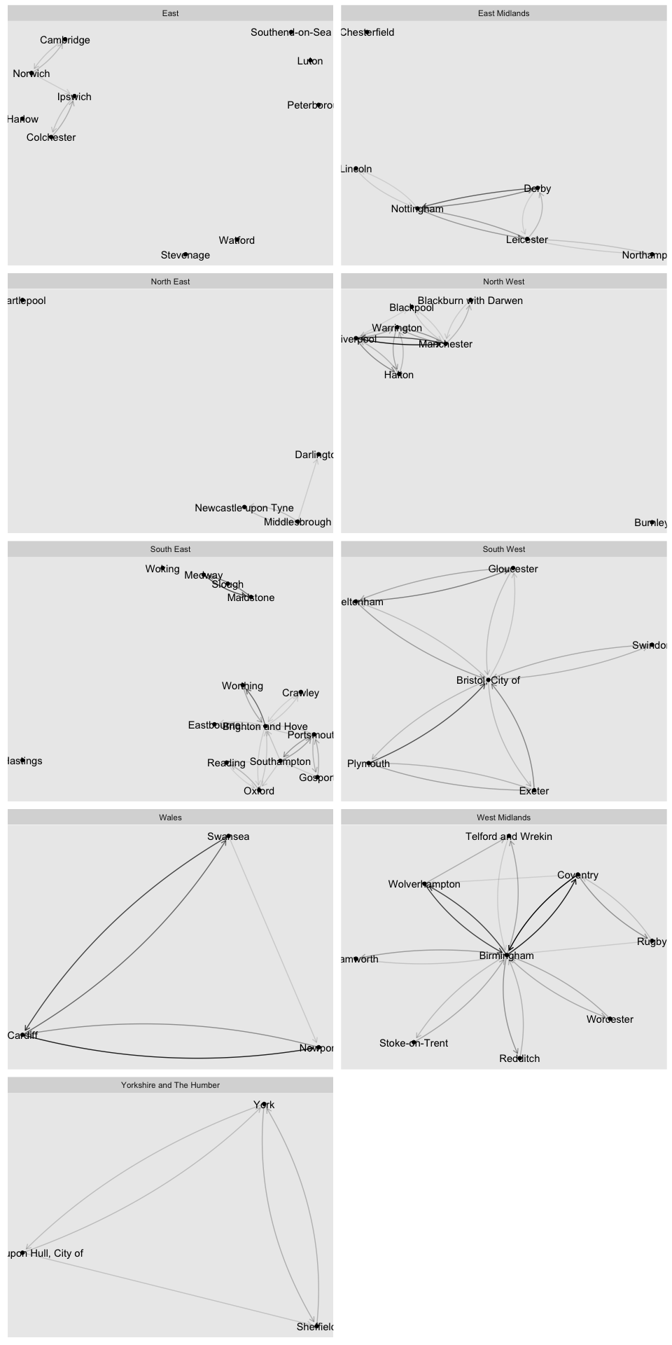
Visualising the migration flows on a map
A great feature of ggraph is the ability to create your own layouts.
This allows us, using a shapefile we’ll read in now, to place the nodes
on a map of England and Wales and draw the connections between them.
We’ll read in two shapefiles to do this. One that contains the local authorities shapes, from which we’ll take the centroids get the lat lons of each city. The other is an outline of the UK, which we’ll use only for the data visualisation.
library(sf)

uk_map <- read_sf("uk map",
                  "Local_Authority_Districts_December_2017_Full_Clipped_Boundaries_in_Great_Britain") %>%
  select("la_code" = 2, "la_name" = 3) %>%
  st_transform(crs = 4326)

cities_coords <- semi_join(uk_map, towns_and_cities, by = "la_code") %>%
  st_centroid(uk_map)

cities_coords <- cities_coords %>%
  mutate(long = st_coordinates(.)[,1],
         lat = st_coordinates(.)[,2]) %>%
  as.data.frame() %>%
  select(-geometry) %>%
  as_tibble()

uk_map_outline <- read_sf("uk map", "NUTS_Level_1_January_2018_Ultra_Generalised_Clipped_Boundaries_in_the_United_Kingdom") %>%
  st_transform(crs = 4326) %>%
  filter(!(nuts118nm %in% c("Scotland", "Northern Ireland"))) %>%
  st_union()
We’ll now need to re-create our nodes and edges, merging in the latitude and longitude of all the towns and cities.
nodes <- migration %>%
  select(out_la) %>%
  distinct() %>%
  rowid_to_column(var = "id") %>%
  rename("city" = out_la)

edges <- migration %>%
  group_by(out_la, in_la) %>%
  filter(age %in% c(23:30)) %>%
  summarise(moves = sum(moves)) %>%
  ungroup() %>%
  left_join(nodes, by = c("out_la" = "city")) %>%
  rename("from" = id)

edges <- edges %>%
  left_join(nodes, by = c("in_la" = "city")) %>%
  rename("to" = id)

edges <- edges %>% select(from, to, moves)

cities_coords <- cities_coords %>%
  right_join(nodes, by = c("la_name" = "city")) %>%
  select(-la_code)

cities_coords[cities_coords$la_name == "London",]$long <- 0.1278
cities_coords[cities_coords$la_name == "London",]$lat <- 51.5074

moves_total <- edges %>%
  group_by(to) %>%
  summarise(total_moves = sum(moves)) %>%
  ungroup() %>%
  rename("id" = to)

nodes <- nodes %>% left_join(moves_total, by = "id")
We can now create the custom node layout using the create_layout()
function, passing it the coordinates from the cities_coords dataframe.
migration_coords <- graph_from_data_frame(d = edges %>% filter(moves > 50), vertices = nodes, directed = TRUE)

migration_coords <- create_layout(migration_coords,
              layout = bind_cols(list("x" = cities_coords$long, "y" = cities_coords$lat)))
We can then pass this into a call to ggraph(), producing the resulting
visualisation.
ggraph(migration_coords) +
geom_edge_fan(aes(alpha = moves, width = moves, col = moves), arrow = arrow(length = unit(2, "mm")),
end_cap = circle(4, "mm"), show.legend = FALSE) +
geom_node_point(aes(size = total_moves), col = "darkgrey", show.legend = FALSE) +
geom_node_text(aes(label = city), vjust = -0.5, family = "Segoe UI Light",
size = 5, color = "darkgrey") +
scale_alpha_continuous(range = c(0.1, 0.5)) +
scale_edge_width(range = c(0.2, 1)) +
scale_edge_color_distiller(palette = "Reds") +
geom_sf(data = uk_map_outline, fill = NA, col = "lightgrey", size = 0.1) +
labs(title = "Internal Migration of young people between England and Wales's largest towns and cities") +
theme_graph(border = FALSE, title_family = "Segoe UI Light",
title_colour = "darkgrey", title_size = 20,
background = "#0E0E16")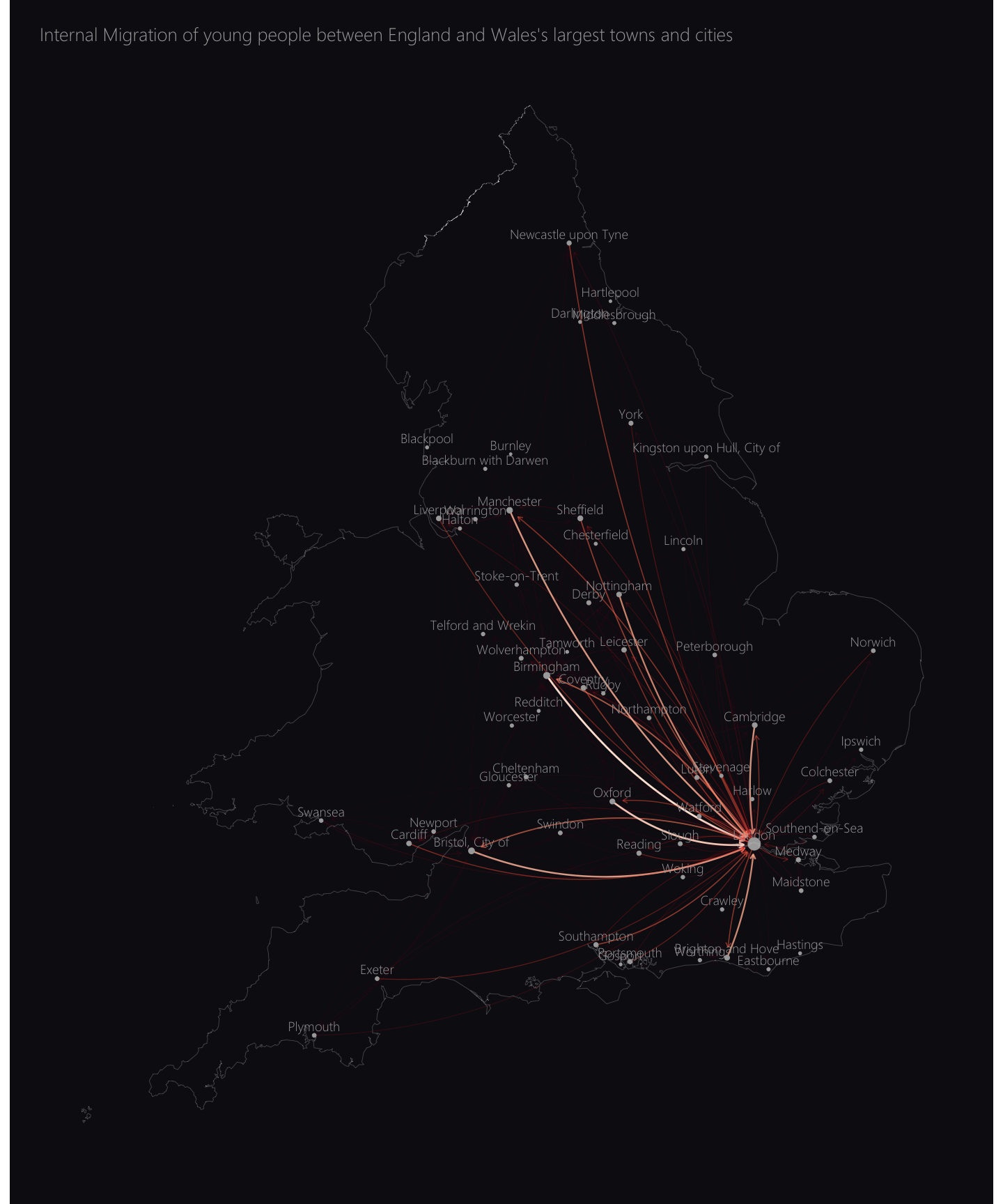 We can see from
the above visualisation that a large share of the internal migration of
23 - 30 year olds in England and Wales is people moving to London.
We can see from
the above visualisation that a large share of the internal migration of
23 - 30 year olds in England and Wales is people moving to London.
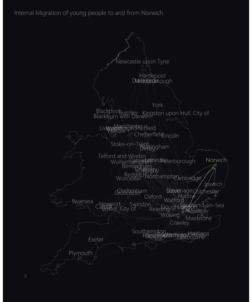
If we want to focus in on migration to and from a particular city, we can create a function that produces a visual similar to the one above, but that highlights the edges that connect to the city in question.
plot_migration_map <- function(city, color = "skyblue"){

  city_id <- nodes[nodes$city == city,]$id

  edges <- edges %>% mutate(is_city = to %in% city_id | from %in% city_id)
  nodes <- nodes %>% mutate(is_city = id == city_id)

  migration_coords <- graph_from_data_frame(d = edges %>% filter(moves > 50), vertices = nodes, directed = TRUE)

  migration_coords <- create_layout(migration_coords,
                                    layout = bind_cols(list("x" = cities_coords$long, "y" = cities_coords$lat)))

  ggraph(migration_coords) +
    geom_edge_fan(aes(width = moves, col = is_city == TRUE, alpha = is_city),
                  arrow = arrow(length = unit(2, "mm")),
                  end_cap = circle(4, "mm"), show.legend = FALSE) +
    geom_node_point(aes(size = total_moves), col = "darkgrey", alpha = 0.1, show.legend = FALSE) +
    geom_node_text(aes(label = city, color = is_city), vjust = -0.5, family = "Segoe UI Light",
                 size = 6, show.legend = FALSE) +
    scale_color_manual(values = c("TRUE" = color, "FALSE" = "darkgrey")) +
    scale_edge_width(range = c(0.2, 1)) +
    scale_edge_alpha_discrete(range = c(0.1, 4)) +
    scale_edge_color_manual(values = c("TRUE" = color, "FALSE" = "darkgrey")) +
    geom_sf(data = uk_map_outline, fill = NA, col = "lightgrey", size = 0.1) +
    labs(title = paste0("Internal Migration of young people to and from ", city)) +
    theme_graph(border = FALSE, title_family = "Segoe UI Light",
                title_colour = "darkgrey",
                background = "#0E0E16")

}
We can then plot any location we’re interested in to identify how the number and geographic spread of their connections vary.
plot_migration_map(city = "Birmingham", color = "#9A054A")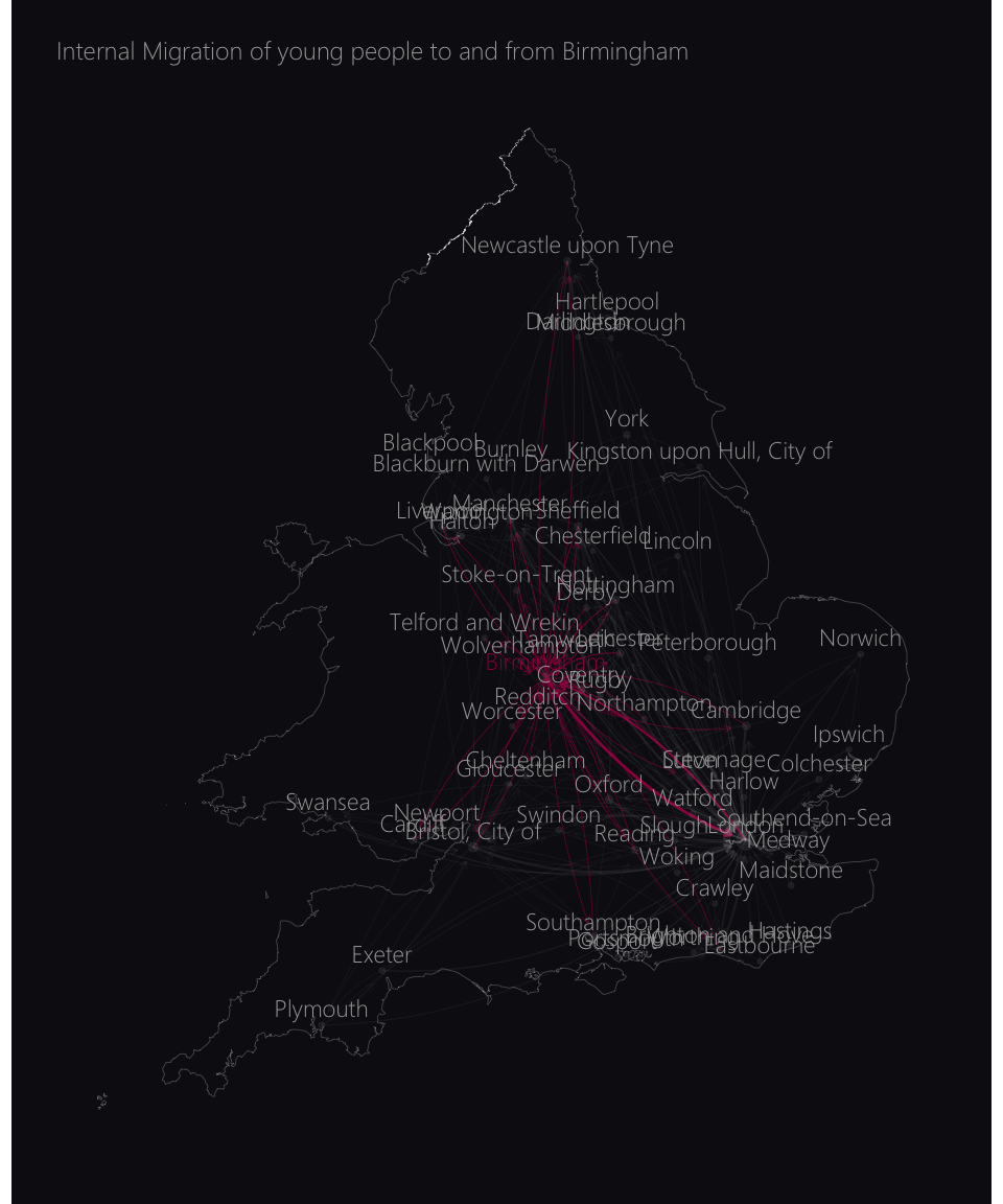
plot_migration_map("Manchester", color = "red")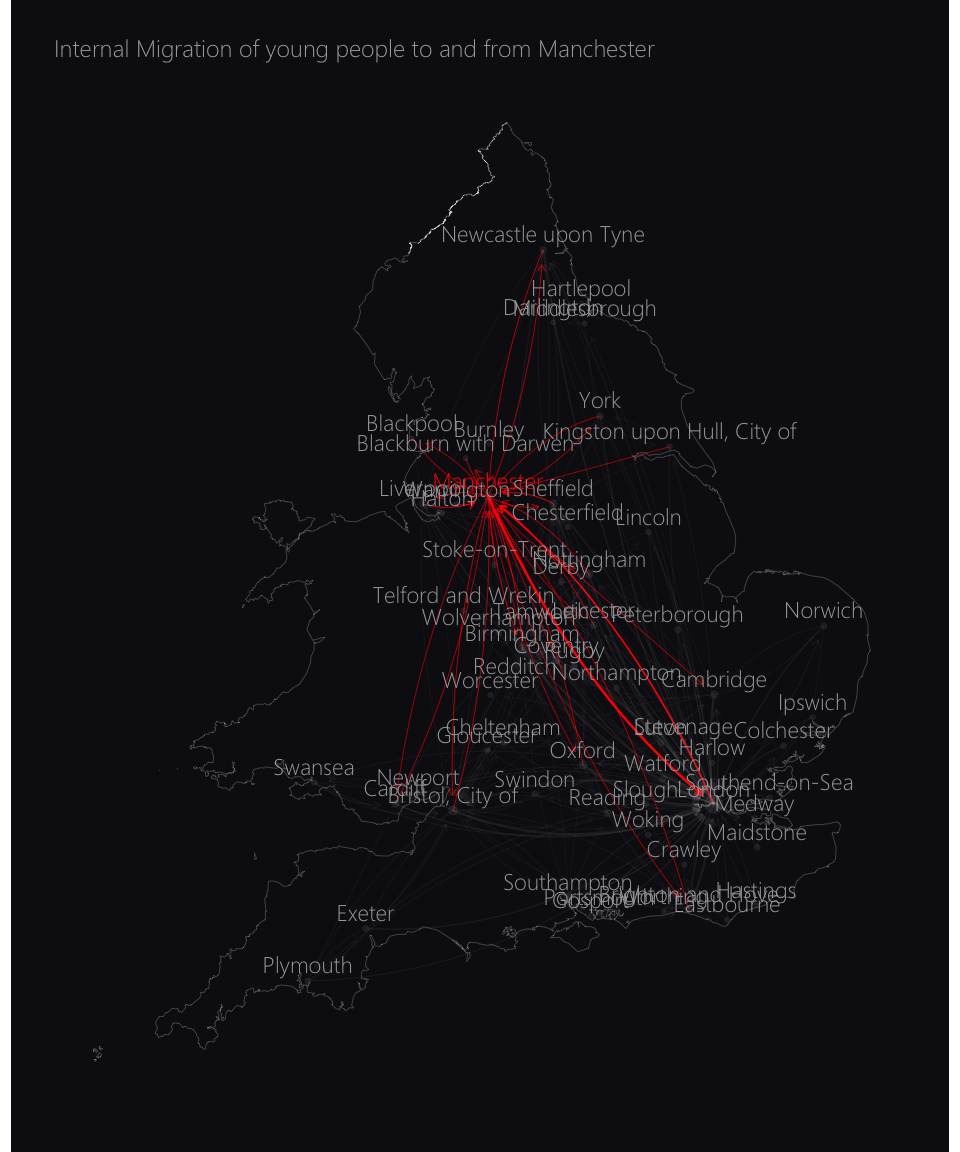
plot_migration_map("Cambridge", color = "#ED700A")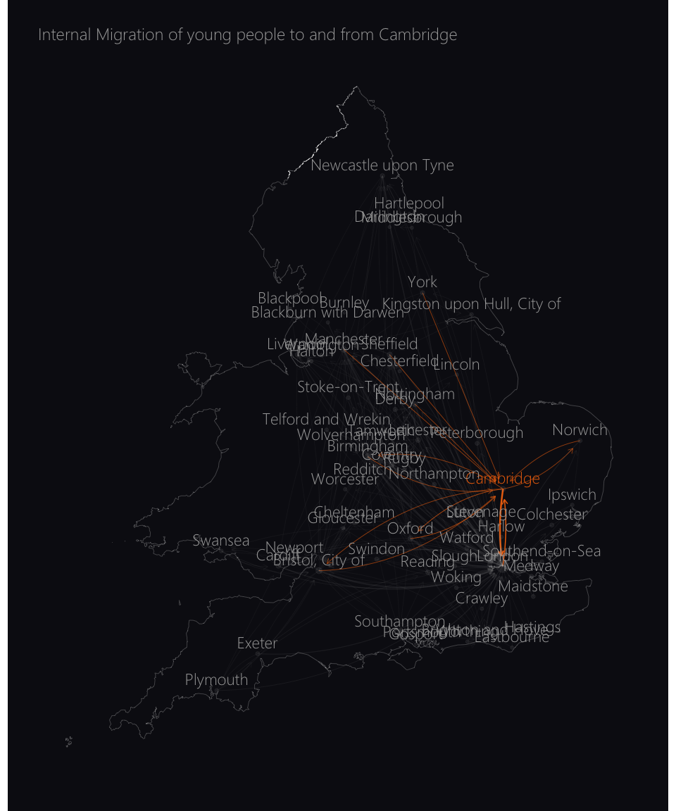
plot_migration_map("Norwich", color = "#BBCEA4")